
Friday, June 27, 2008
Remote Sensing
This is a screen shot of a remote sensing chart taken from GoogleEarth which shows the world population density. This global chart even comes with a built in key on the rotational globe.

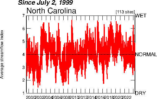
Index Value Plot
This index value plot illustrates the average steamflow index by year. The index varies in between wet and dry. This plot gives an index value instead of an absolute value.

Scatterplot
A scatterplot is a two-dimensional graph that helps visualize the relationship between two variables, or bivariate data. This scatterplot illustrates the relationship between the ages of husband and wives.


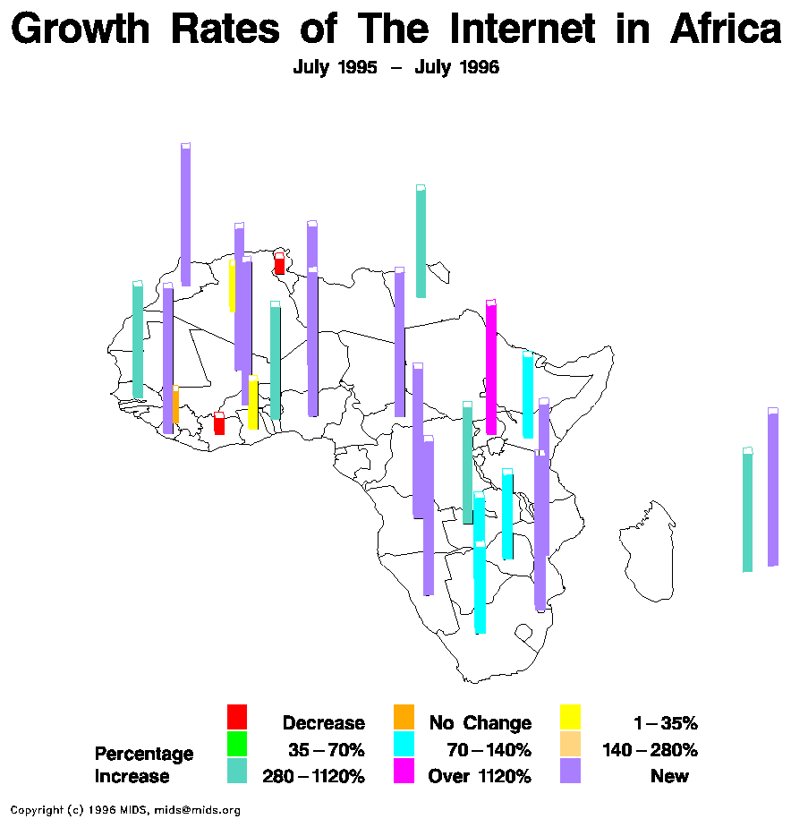
Continuously Variable Proportional Circle Map
This type of proportional circle map uses circles to create point data. It uses both the sizes and the colors of the circles to give statistical information about an area.


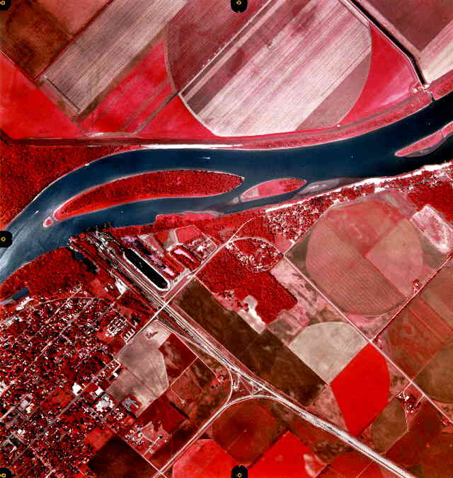
DOQQ
This DOQQ map, or Digital Orthophoto Quarter Quadrangle, is a satelite image of Metromedia Square in Los Angeles, California. This aerial maps are used by the USGS and are specifically to map one quarter of a 7.5-minute quadrangle.


DEM
This is a DEM, or Digital Elevation Map, of the Big Bend National Park and the Big Bend Ranch State Natural Area. This map shows terrain elevation throughout both the park and the natural area usnig a type of infrared.


DLG
This DLG, or Digital Line Graph, represents Columbus, Georgia. In DLG maps the different lines signify differents parts land. DLG maps are useful topographic maps that are easy to read.


DRG
A DRG, or Digital Raster Graphic, map is a scanned image of a US Geological Survey standard series topographic map. This particular map is of the Emeral Bay State Park located in California twenty-two miles south of Tahoe City.


Isopleth
Below is an isopleth map that illustrates the amount of snow fall during the winter of 1981. This map connects points to create lines where there was an equal amount of snow fall.


Isopach
An isopach uses lines drawn on a map to join points of equal thickness throughout that region. Below is an illustration of the Earth with lines depicting the approximate thickness of ejecta on this part of the globe.


Isohyet
A isohyet map helps illustrate the amount of rainfall in one given area by connecting points that receive the same amount of rainfall. This is a map of South Tyne at Haydon Bridge located in Northumberland which is a county if the North East of England.


Isotach
The isotachs on this map illustrate the development of a mesolow in the Foothills of Raleigh, NC. This type of map is important for meteorologists during the developments of winter storms.


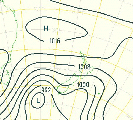
Isobar
Below is an isobar map of New Zealand and eastern Australia. This isobar map illustrates the connecting points of equal barometric pressure on a map and the latitude and longitude on a the map.

LIDAR
The University of California, Berkely performed a field study at the Savanna Oak Foundation is Vermount. The below map is a pulsed LIDAR, or Light Detection and Ranging, map that illustrates a three-dimensional image of the Savanna canopy structure.


Doppler Radar
This is a Doppler radar photograph of a hurricane on the edge of South Florida. Doppler radar helps meteorologists determine the speed and amount of precipitation of a hurricane. Doppler radars helps meteorologists everyday in determining the weather and severity of weather related natural disasters.


Black and White Aerial Photo
This is a black and white aerial photograph of Harrisburg, PA. The black and white large image makes it easy to find the perimeter of the park that has been traced with a white border. We can also easily map how large the Susquehanna River which divides downtown Harrisburg from the town on the west.


Infrared Aerial Photo

Cartographic Animation
Below is a still shot of a cartographic animation that shows the amount of deaths by percentages in Nebraska county by four specific diseases. The diseases are cancer, cerebrovascular, heart disease, and chronic lung disease. Click on the picture below to see the java cartographic animation. In order to maneuver around the animation just bring the cursor over the key on the right side of the map.

Wednesday, June 25, 2008
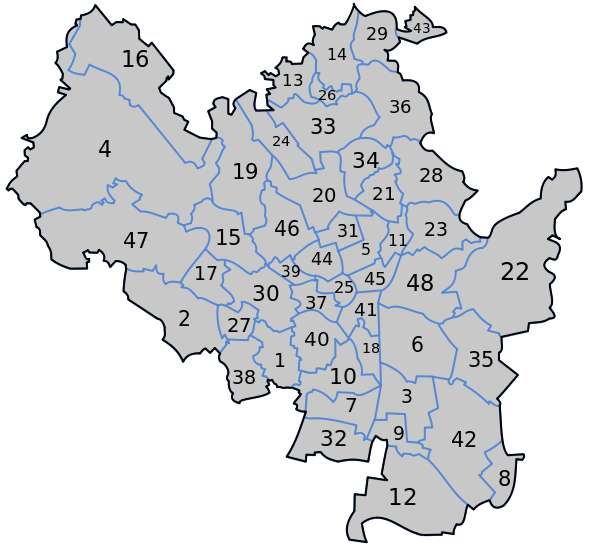
Statistical Map
For this map we observe the different areas of the country being measured in regards to the rate of growth for the population. This map contains statistics in a unique pattern that displayed figures in such a manner that pinpoints exactly where the growth is occurring and how much of it is taking place.

Cartogram
This map is an illustration of the world's nation population in 2002. Cartogram maps are designed for statistical data by region. This map uses different colors, numbers the regions, and places actual statistical data on each region to make it very easy to understand.


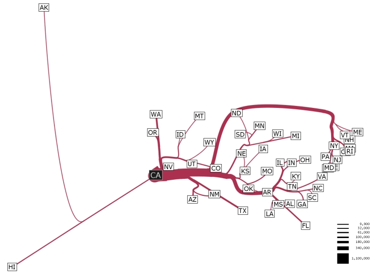
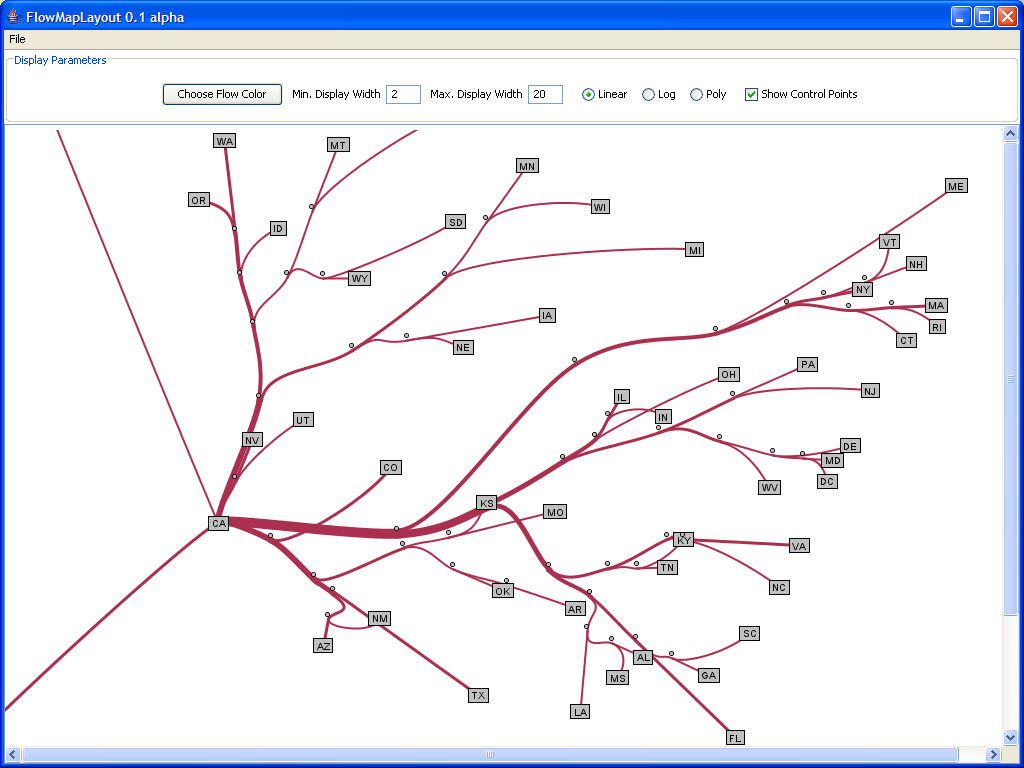
Flow Map
Below is a flow map of migration from California from during 1995-2000. Most flow maps are drawn by hand, but this one was computer generated with sophisticated computer software in 2005 by Stanford University.

Isoline Map
In this isoline map the contouring lines depict the general areal distribution of precipitation. Isoline maps are made up of lines that join points of equal value. All of the lines in the below map signify a certain amount of precipitation between 50 to 4,000 mm.


Proportional Circle Map
This map displays small blue dots that signify different levels of population density. The proportional map contains areas on the map that show various ratios of population throughout that part of the state.


Choropleth Map
A choropleth map is a thematic map which can use a key to grade the amount on intesity in a cerain area. This choropleth map depicts the amount of hispanic or latinos within Florida. This map uses shades of green in order to demonstrate quantitative data taken during the 2003 Census.


Dot Distribution Map
This dot distribution map illustrates the population throughout the United States. Each dot signifies 7,500 people. These type of maps make it easy to depict highly populated areas because there are more white dots than black space in the populated areas.


Propaganda Map
A propaganda map is a map that essentially hold half truths or misinformation. In the below map their are advertising Nazi War Aims that showed evidence of Nazi's trying to take over. Obviously, this could of been true, but this map claims that this map was actually a secret Nazi map found that proved this rumor in 1957.


Hypsometric Map
A hypsometric map depicts the relief of earth’s surface by means of contours, form lines, hachures, shading, tinting, or relief models. This specific map uses colors to demonstrate the elevation throughout Canada.


PLSS Map
This Public Land Survey System (PLSS) map illustrates the principle meridians and base lines governing the U.S. public land surveys. This map was released by the U.S. Department of the Interior Bureau of Land Management.


Cadastral Map
Below is a cadastral map of Brno located in the Czech Republic. Brno is the second largest city within the Czech Republic. Cadastral Maps show the boundaries and ownership of land parcels.

Thematic Map
This map illustrates soil moisture throughout the United States. This map can be helpful for farmers while they determining the timing for irrigation. In Florida, we can take note of how moist the soil is in comparison to the west coast soil. Farmers can use this information to properly decide which crops will be bountiful in each area.


Topographic Map
Camp Yawgoog is a Boy Scout Reservation which acts as a residential camp in Rockville, Rhode Island. This map accurately depicts the physical features of this area. The contouring lines indicate suface elevation and help depict three-dimensional features of a landscape on a two-dimensional surface.


Planimetric Map
This planimetric map shows a digital display of a community during preconstruction in North Carolina. This planimetric maps are often used during preconstruction to help map out things like roads, buildings, water, fences, and vegetation. In this map the yellow lines map out roads, orange represent building, the blue stands for water, and the green for vegetation.


Mental Map
This is an illustration of the city of London conveyed through the author's mind. According to his subjective viewpoint, we notice that the city names are displayed with varying size. This mental map shows an emphasis on specific places of importance like buckingham palace.


Subscribe to:
Posts (Atom)
