
Sunday, July 6, 2008
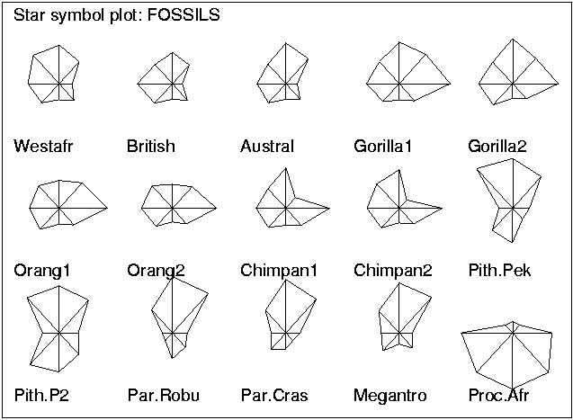
Star Plots
Below is a star plot of crime rates in different cities around the US. Star plots are fairly complex to understand, but they are essentially used as a technique for graphical data anylsis. These various shapes represent specific data in a unique form.

Correlation Matrix
A correlation matrix can be used to find a correlation among all pairs of data sets within a study or experiment. The correlation matrix below shows genomes to phenomes within a set of livestock. Different colors are used along the grid to display the data.


Similarity Matrix
This similarity matrix illustrates the similarities between sets of 3D models. A similarity matrix can be used to find the overall amount of similarities between data sets. The data is broken down by the graph along with pictures on the side to reinforce the analysis.


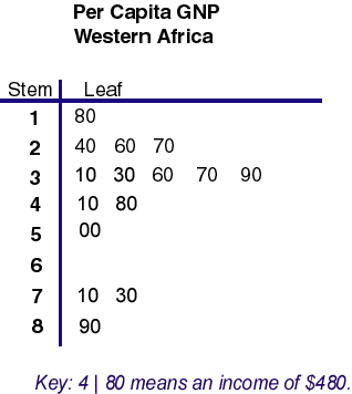
Stem and Leaf Plot
Stem and leaf plots are used to organize numerical data in a list form. With this type of data organization it easy to pull a average, medium, or range of the data. The below stem and leaf plot provides numerical data of the per capita Gross National Product, or GNP, in Western Africa.

Box Plot
Box plots are most often used in statistics in order to display data indicating symmetry and central tendency. The below graph gives us a median of scores on a test by amount of anxiety. Surprisingly, this graph indicates that the students with the highest anxiety level scored better had a higher median than the other students with lower anxiety levels.


Histogram

Parallel Coordinate Graph
A parallel coordinate graph helps find relationships among variables by graphing each variable on a vertical axis and the data is plotted as a connecting set of points. Below is a computer generated 2D parallel coordinate graph used as an example for a parallel coordinate graph software.


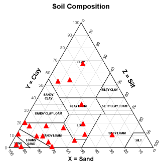
Triangular Plot
A triangle plot, or ternary plot, is a graph that finds the median of three variables through percentages. These graphs are most commonly used in studies involving the composition or texture of soil or rocks. The below graph has divided regions of the map to better identify different types of soil.

Wind Rose
A wind rose is a diagram that shows the distribution of wind speed and direction in a specific region or location. The below wind rose was created for the Seattle area by the Office of the Washington State Climatologist.


Climograph
A climograph is a bar graph and line graph that show monthly averages of temperatures and precipitation for a specific location. The below climograph of montreal allows us to gather data, such as:
 For more information visit: http://geography.ridley.on.ca/CGC1D/Students/Quebec2/Geo./Climographs.htm
- The average temperature 6.5°C
- Temperature range: 20°C
- Total precipitation: 940mm.
- Season of maximum precipitation: Summer
 For more information visit: http://geography.ridley.on.ca/CGC1D/Students/Quebec2/Geo./Climographs.htm
Population Profile
This type of population profile, or population pyramid helps visualize the amount of people within a certain age group in different areas of the world. The vertical axis helps making comparisons easier because all bars are lined up together.


Lorenz Curve
The Lorenz curve graph is used in economics to illustrate the proportionality of a distribution. Below is an example of what each line and axis should have in order to create a Lorenz curve graph.


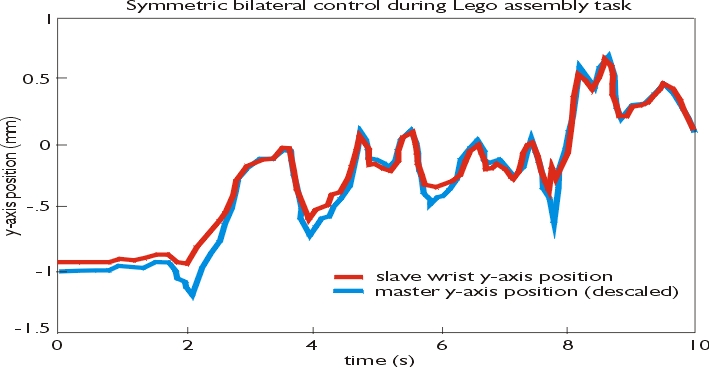
Bilateral Graph
A bilateral graph is generally any type of graph that helps you visualize the similarities or difference that two related variables share. Below is a graph that compares two similar models of "robot arms" while assembling a set of Legos.

Nominal Area Choropleth Map
A nominal area choropleth map typically has a color scheme to help illustrate the intensity of the nominal data being counted within the areas specified.
The different colors along the state are broken down into various sectors in order to better convey the given data.
The different colors along the state are broken down into various sectors in order to better convey the given data.

Unstandardized Choropleth Map
A unstandardized choropleth map most generally applies the raw numbers of data on a graph with an x & y axis. On the below graph there is a line that strikes through the average of all the points to depict a positive or negative trend.


Standardized Choropleth Map
A standardized choropleth map is much more visual and easier to read than the unstandardized choropleth map. This map uses averages within specific areas of a larger location to illustrate the approximate intensity of the variable being measured.


Univariate Choropleth Map
Univariate choropleth maps are used to measure a single set of data. In the below graph it is very specifically measuring the amount of urban areas within the states. The different shades of gray are used to display the data appropriately in this case.


Bivariate Choropleth Map
A bivariate choropleth map is used to measure to sets of data to better visualize their similarities and differences. The below map uses two separate graphs to show both the univariate and bivariate data on the map.


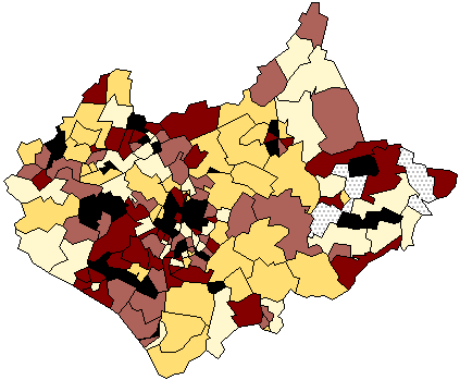
Unclassed Choropleth Map
Unclassed choropleth maps do not use keys or legends to explain the data the shading of the data. This map was actually drawn to help visualize the proportion of children aged 0-15, using five classes based upon an equal bin interval classification scheme. Without the key it would be impossible to know which areas are more populated than others.

Classed Choropleth Map
A classed choropleth map helps understand a choropleth map much clearer than the unclassed choropleth map. This map uses a specific order to colors and applies a legend or key to label each color shown on the map. An example of this is how the red state stands out signifying the different data set up by the legend on the left hand side.


Range Graded Proportional Circle Map
This range graded proportional circle map uses the area of the circles to show their proportional to the channel width. The sizes of circle are what set this map apart from other circle maps. This specific map also uses color to indicate the color of the water, but that is not required for a range graded proportional circle map.


Subscribe to:
Comments (Atom)
